Don’t Shoot PDX
Web Redesign for a Cause
The Project
Our team was tasked with redesigning the website of a non-profit organization of our choosing, based in Portland Oregon. Undertaken within the constraints of an intensive program timeline, our project would be completed within two weeks and without stakeholder contact.
My Role
UX designer
Content Strategist
Team
D Pine
Wendy Davenport
Madi Muller
Alex Werner
Tools
Figma
InVision
Adobe Illustrator
Miro
Monday
G Suite
The Problem
Users are most likely to engage with local non-profit organizations via familiar modalities such as social media. However, users struggle to independently source valuable information from said non-profit’s sites, resulting in a lack of confidence that demotivates participation in change-initiatives.
For this project we asked: How might we help Don’t Shoot PDX amplify and clarify their messaging in ways that replicate familiar modalities, ultimately helping to inspire confidence in and motivate users to participate in change-based missions?
Discover
Assumptions
User Sourcing
User Interviews
Define
Insights
Use Cases
Develop
Ideation
Prioritization
Sitemapping
Design
Prototyping
Testing
Primary Research - User Interviews
To learn more about how users access socially motivated information and the platforms / methods they utilize, we conducted semi-structured interviews with individuals we reached via Don’t Shoot PDX’s Instagram following.
Insight 1
To learn more about how users access socially motivated information and the platforms / methods they utilize, we conducted semi-structured interviews with individuals we reached via Don’t Shoot PDX’s Instagram following.
Insight 2
Users are fatigued by a growing body of unfocused resources without obvious relevance or context.
Insight 3
Users stay connected through curated content via emails and social media feeds
Establishing Use Cases and Usability
Using the above insights to define use cases, our design process kicked off with a series of usability tests. Featuring Don’t Shoot PDX’s current site, we had users perform a series of tasks based on the most common use cases described by the users we interviewed.
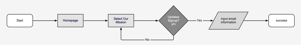
User Flow 1 - Signing Up for Newsletter Update
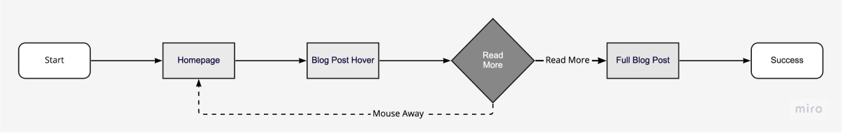
User Flow 2 - Finding a Relevant Blog Post
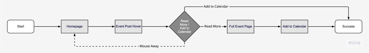
User Flow 3 - Finding a Local Event
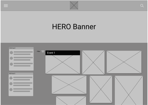
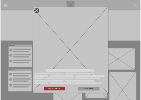
Lofi Wireframing
We started visualing an MVP through lofi wireframes in Figma. The challenge here was considering the substantial volume of content currently featured on Don’t Shoot PDX’s site as well as their indiscrimate navigation systems.
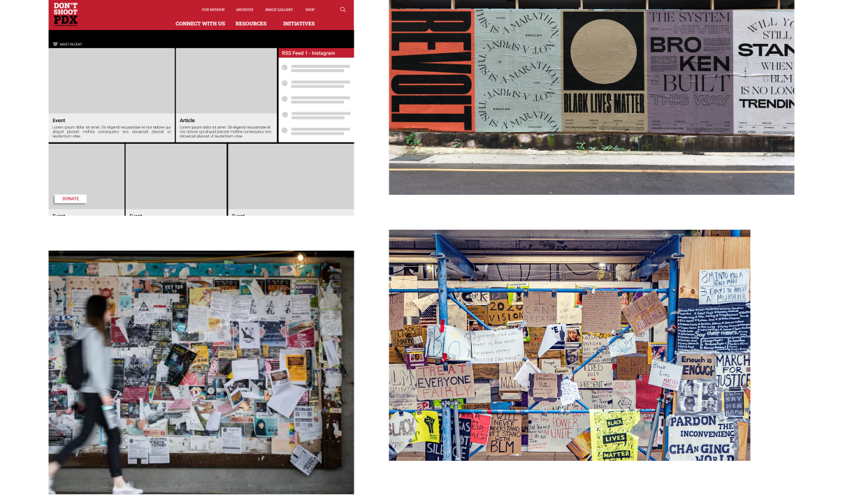
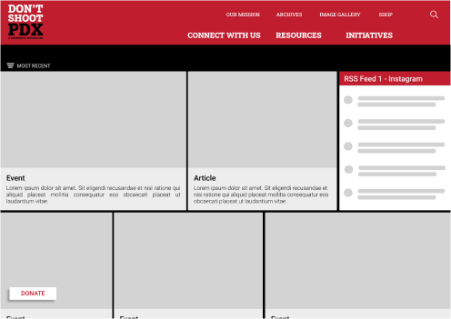
Layout - Emulating Historic and Contemporary Messaging
The layout is where our concept most obviously, aesthetically, and effectively intersects with Don’t Shoot PDX’s work and capacity for effective messaging. By looking to the bulletin boards and wild posting practices consistently utilized throughout a sweeping range of social movements, the compelling visuals and writings - the direct reflections of Don’t Shoot PDX’s mission - are authentically elevated.
My personal role emphasized creative concepts and direction.
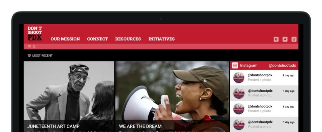
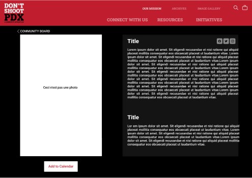
Midfi Wireframes
To incorporate the feedback we received during our brief usability testing, we worked to balance the graphic components of our UI with enough primary navigation options to indicate the distinction between the navigation bar and the body of the page.
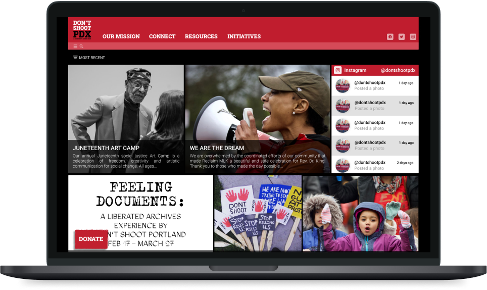
High Fidelity Prototype
Made in collaboration with all team members.